Selling online
10 min read
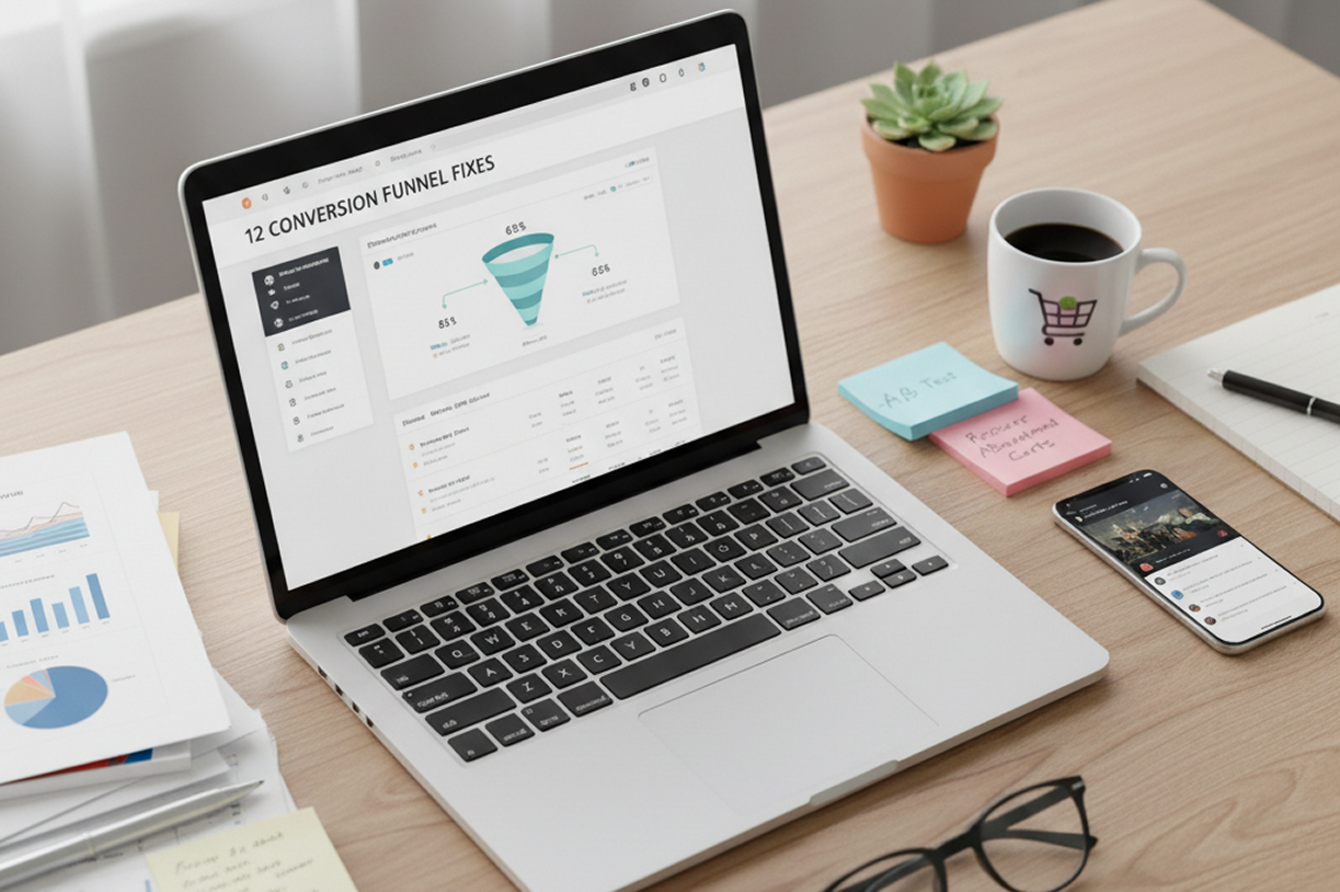
12 Conversion funnel fixes that stop losing ready buyers
This article provides 12 practical conversion funnel fixes to help businesses stop losing potential buyers at every stage of their sales process. By implementing these strategies, you can optimize your funnel for increased conversions and improved customer retention.

Written by
Christian CabalunaReviewed by
Katarzyna Chmielniak
Updated on
February 9, 2026
Published on
February 5, 2026
Your conversion funnel isn’t doing its job, and everyone acts like that is normal. People click, scroll, linger… and then disappear. You know they were ready to buy. You know they had their wallets out. Somewhere between the page load and the final click, your funnel is quietly pushing them away.
This article is about fixing that exact moment. The last stretch. The part where intent is high and patience is low. We will give you 12 fixes to make your funnel actually work the way it is supposed to.
What is a conversion funnel?
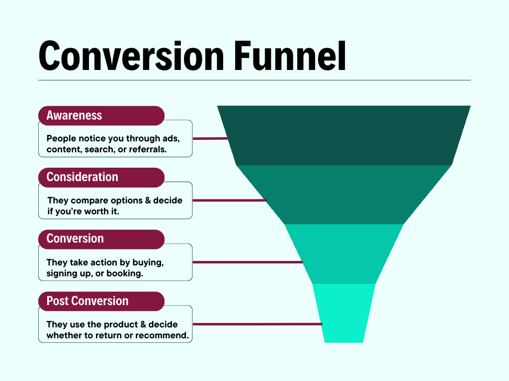
A conversion funnel is the step-by-step path your audience takes from first contact with your brand to taking a specific action you want, like signing up or making a purchase.
It maps how people move through your marketing and sales process. Each conversion funnel stage shows what they do and what pushes them forward or causes them to drop off. The goal of a conversion funnel is simple: take the right people toward a decision without friction or delays.
A well-optimized conversion funnel follows a clear flow:
- Awareness: People discover you. They see an ad, read a post, land on a page, or hear about you through someone else. They are learning that you exist.
- Consideration: Now, people start evaluating you. They compare options, review features, check pricing, and look for proof. They are deciding if you are worth choosing.
- Conversion: People take action. They buy, sign up, book, or submit details. This is the moment the funnel is built for.
- Post Conversion (Retention): In this stage, customers decide if they stay. They use the product and interact with support. Main focus here is on onboarding, usage, customer retention, repeat purchases, and referrals.
5 Clear signals your conversion funnel is pushing buyers away
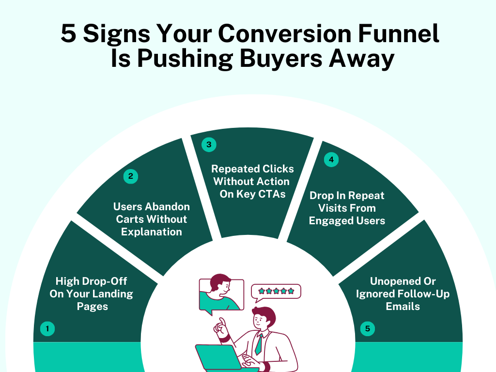
Your funnel is letting people walk out without a word, and you probably haven’t noticed. Here are 5 clear signs showing exactly where it is pushing buyers away.
[fs-toc-omit]1. High drop-off On your landing pages
People come and leave before anything even registers. Not a scroll. Not a pause. They bounce like they clicked the wrong link. That means the page fails in the first few seconds. Whatever promise brought them there does not match what loads on the screen.
This is the kind of drop-off where traffic quality isn’t the problem. The same thing happens across digital marketing ads and organic search. The product page technically “says” the right things, but nothing connects immediately, so people move on without thinking twice.
[fs-toc-omit]2. Users abandon carts without explanation
These buyers already decided the product made sense. They didn’t wander. They didn’t hesitate early. They added items and reached the cart. Then everything stops. No error messages. No retries. Just a clean exit.
When this keeps happening at the same place, it means something changes the moment commitment increases. The buying experience shifts, even slightly, and people back out without saying a word. The cart becomes the point where certainty drops.
[fs-toc-omit]3. Repeated clicks without action on key CTAs
This shows up in session recordings more than charts. Users click a button. Sometimes 3 or 4 times. They wait… they hover… they scroll up and down. Then they leave. That user behavior means the button promises progress but delivers nothing obvious.
Buyers expect momentum. When a click doesn’t take them forward, they stop trusting the path. After a few failed attempts, they don’t look for another option. They leave.
[fs-toc-omit]4. Drop in repeat visits from engaged users
These site visitors don’t act impulsively. They read and open multiple pages. They spend real time – but then they never come back.
That pattern means the marketing funnel didn’t grab onto the experience. Nothing stuck strongly enough to pull them back later. Interest was there, but without a return visit, the buyer’s journey just fades out instead of moving forward.
[fs-toc-omit]5. Unopened or ignored follow-up emails
Emails go out, and delivery looks fine too. But the numbers don’t move – opens stay flat, clicks don’t happen. That gap matters because up to 98% of leads disappear between the first interaction and an email sign-up.
That silence means the email shows up out of nowhere. It does not match what they were just doing, so they swipe past it without thinking. After that happens a few times, your marketing efforts stop standing out at all.
12 Conversion funnel fixes that stop lead drop-off at every stage
Leads are slipping away at every step, and it is easy to miss. Here’s a set of 12 practical fixes for conversion funnel optimization that actually keep people going from start to finish.
Fixes for the awareness stage (top of the funnel - TOFU)
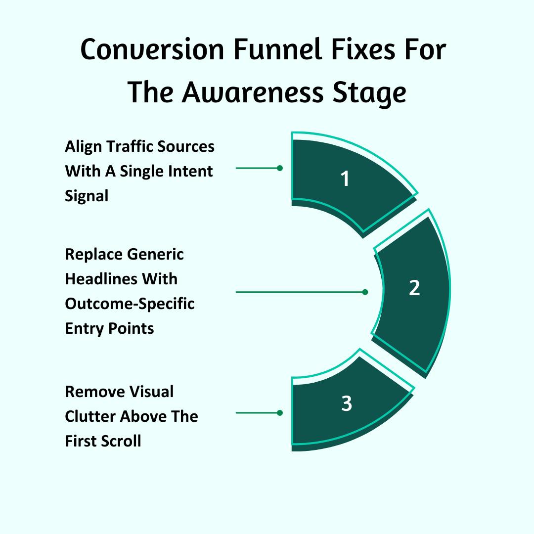
[fs-toc-omit]1. Align traffic sources with a single intent signal
Right now, you are sending people who are thinking very different thoughts to the same first page. Some are trying to confirm a suspicion. Some are trying to price something. Some are trying to replace a tool. Some are just exploring. When one page tries to serve all of them, it serves none of them well.
You have to force every entry point to answer one mental question and one mental question only. When that happens, the page generates interest and attracts customers. When it does not, the user leaves before they consciously process anything.
Do this:
- Write down every paid ad on online marketing channels, organic page, referral source, and email link. And next to each, write the exact sentence the user is finishing in their head when they click.
- Create a separate landing page for each sentence – not for each product or targeted campaign.
- Remove any traffic path that sends users to a page where their mental sentence is not completed by the first line.
- Watch 5 sessions from each traffic source. Stop as soon as the user leaves, and note exactly what idea they didn’t understand.
[fs-toc-omit]2. Replace generic headlines with outcome-specific entry points
Most headlines talk about the product. That is not what people came for. They are looking for a change. When the headline names the tool instead of the result, the users have to figure out what it actually means. That extra step slows everything down. And slowness causes exits.
This fix replaces “product language” with “outcome language.” The headline must sound like the end of the user’s problem statement – not the start of your pitch.
Do this:
- Collect 25 exact phrases people use to describe the result they want, then use those exact words in headlines.
- Delete any headline that mentions your brand, product, category, or vague benefits – keep it all about the outcome.
- Make headlines start with action words and end with a clear change – not with nouns or descriptors.
- Show just the headline to someone and ask them what would actually change for them – if they can’t tell you, rewrite it.
[fs-toc-omit]3. Remove visual clutter above the first scroll
The first screen is doing too much. It asks the people to look, choose, figure out, and decide – all at once. That doesn’t move users forward. It pushes them out. During initial awareness, you need to turn the first screen into a single-direction ramp. One message. One action. One thing to focus on. Everything else has to step aside.
Do this:
- Get rid of everything above the fold that doesn’t clearly show the result or push the user toward the next step – secondary buttons, badges, awards, customer testimonials, fancy visuals, all of it.
- Keep the first screen simple – one headline, one supporting line, one main action, one visual.
- Turn off navigation menus on high-intent pages so users can only go forward or leave – nothing else.
- Screenshot the first screen and blur it. Remove anything still stealing attention that doesn’t help get the message across.
Fixes for the consideration stage (middle of the funnel - MOFU)
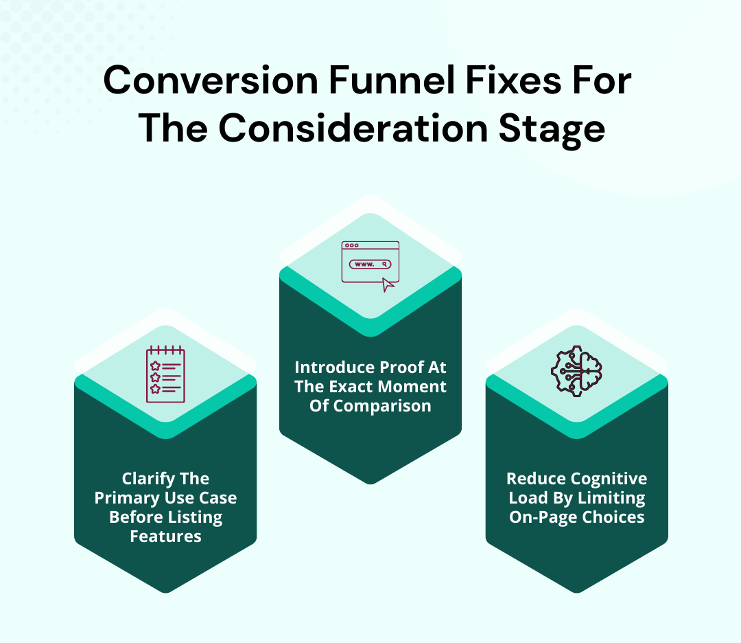
[fs-toc-omit]4. Clarify the primary use case before listing features
Users see a bunch of features before they even know how the product would actually work for them. That makes them try to picture it in their head, which takes effort. And when the brain is busy like that, attention drops – and they leave. The trick is to show one clear workflow first. Let the user see themselves using the product before showing what it can do.
Do this:
- Rewrite the top of your mid-funnel pages to show one full workflow with the product – start to finish.
- Drop all the feature lists below that workflow and put them in the same order as the tasks happen in the scenario.
- Swap out feature names for task-focused descriptions – like “Assign tasks to clients” instead of “User management.”
- Have users explain how they would use the product after reading just the first section. Tweak it until what they say matches your use case.
[fs-toc-omit]5. Introduce proof at the exact moment of comparison
Proof is either shown too soon, before the user is actually thinking about options, or too late, after they have already paused. Either way, it doesn’t do anything. Place proof exactly where the user starts comparing – not before and not after. Your marketing strategy has to answer the exact question running through their head in that moment.
Do this:
- Find the exact sections where users are comparing pricing or options, and put proof right there rather than in a separate testimonial section.
- Make sure the proof matches what they are actually judging – speed, reliability, cost, ease of use.
- Show proof in ways that match how they compare things – side-by-side stats, before-and-after examples, benchmarks.
- Remove any proof that doesn’t directly help with that specific decision, even if it is positive.
[fs-toc-omit]6. Reduce cognitive load by limiting on-page choices
Users are being asked to choose before they even know what is going on. Multiple CTAs, multiple paths, multiple plans, multiple next steps. That kind of overload creates friction. And friction stops movement.
The solution is to line up choices one at a time. One clear action right now – everything else comes later. Just to give you an idea, using a single CTA can increase conversions up to 13.5%.
Do This:
- Keep each page simple: one main action and one secondary action – visually downplayed so it doesn't compete.
- Split multi-option decisions into separate steps. People should see one choice at a time.
- Swap grid-style plan comparisons for a progressive reveal. Users pick one option first, then see the details.
- Watch for hesitation – cursor moves, pauses, hovers. Remove or delay anything that makes people stop without acting.
Fixes for the decision/conversion stage (bottom of the funnel - BOFU)
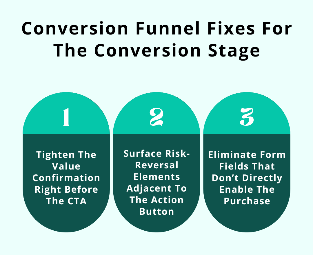
[fs-toc-omit]7. Tighten the value confirmation right before the CTA
Right before someone clicks the button, their brain pauses and thinks – “Wait… is this really worth it?” Most pages just rehash the same points or leave them hanging. That pause? It stops everything. You need a quick and sharp reminder of why this matters – right there at the moment they are about to act.
Do this:
- Right above the button, put a punchy value statement – something that answers “Why now?” in plain words.
- Back it up with a number or concrete result to make it real – “Cut onboarding time by 40%.”
- Remove everything else around the button that doesn’t push that one reason – they shouldn’t have to think twice.
- Try a few variations of that line and see which one gets people clicking fastest.
[fs-toc-omit]8. Surface risk-reversal elements adjacent to the action button
Even people who are ready to buy can hesitate if something looks risky. And you can’t really blame them – 63% of people have faced a cyber threat at least once, so security and trust are top of mind.
Refunds, trials, guarantees – they are usually tucked away where no one notices. Put them right by the button so potential customers see reassurance the moment they are about to click – and that pause disappears completely.
Do This:
- Put a quick reassurance right next to the button – something like “30-day money-back guarantee, no questions asked”.
- Add a small icon – a checkmark or shield – to catch the eye without taking attention away from the button.
- Keep it in the same spot on every page so people immediately notice it.
- Try a few different ways of saying it (“Full refund” vs. “Cancel anytime”) and see what gets people to click without stopping.
[fs-toc-omit]9. Eliminate form fields that don’t directly enable the purchase
Every extra field in a checkout or signup form is just a speed bump. Phone number, job title, extra address – they make people stop and think. Keep only what is needed to finish the purchase and remove everything else that just slows the payment process.
Do this:
- Go through all the form fields. Remove anything that is not absolutely needed.
- Combine fields where you can to make it quicker.
- Show mistakes or missing info as users type – not after they submit.
- Label optional vs. required clearly so users aren’t wondering what they have to fill in.
[fs-toc-omit]Fixes for the post-conversion stage
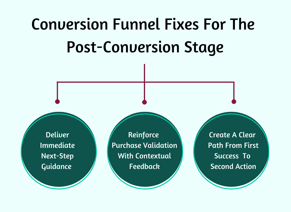
[fs-toc-omit]10. Deliver immediate next-step guidance after completion
Right after someone buys or signs up, they are primed to act. Send them to a boring “Thank you” page, and that energy just disappears. Show them exactly what to do next so these paying customers keep going without stopping.
Do this:
- Right at the top, show exactly what to do next – “Download your guide,” “Set up your account,” “Start your first task.”
- Add a quick line explaining why this step matters right now so people know it is worth doing.
- Make the action obvious with a button or bold link that stands out from everything else.
- Track click-through rates and conversion rates. Tweak the language or visuals until at least 70–80% of users act right away.
[fs-toc-omit]11. Reinforce purchase validation with contextual feedback
A plain “Thank you” barely registers. Right after a purchase, people’s brains are still checking themselves – “Did I make the right move?” You need to show them exactly why their choice matters. To improve the conversion funnel's effectiveness, link it back to the problem they wanted to solve or the result they were chasing.
Do this:
- Add a line like, “You just unlocked X benefit that solves Y problem.” Use their own words from before purchase.
- Show a summary of exactly what they bought – quantity, features they will use first.
- Use a small visual (could be a progress bar or checklist) to show they are on track.
- Add micro-copy – “Check your inbox” or “Start your first task.” This ensures that their decision was correct.
[fs-toc-omit]12. Create a clear path from first success to second action
Once users finish the first step – buying, signing up, or downloading – they usually just stop. That momentum can disappear fast. Don’t let it. Show them exactly what to do next so their first action naturally leads into the second one. Conversion optimization efforts here improve the customer lifetime value without pressure tactics.
Do this:
- Point out the very next thing they should do after finishing – using a feature, scheduling a call, finishing setup.
- Show a progress indicator or step-by-step visual, so they see where they are.
- Make the CTA for the next step impossible to miss. Hide secondary actions for now.
- Do a quick conversion funnel analysis and track how many people take the next step. Adjust messaging or timing until most users move to step two without dropping off.
{{cta-banner-1}}
3 Businesses that perfected their conversion funnel flow
These 3 businesses figured out how to keep momentum instead of losing buyers mid-journey, and their choices are worth paying attention to.
[fs-toc-omit]1. Mannequin mall
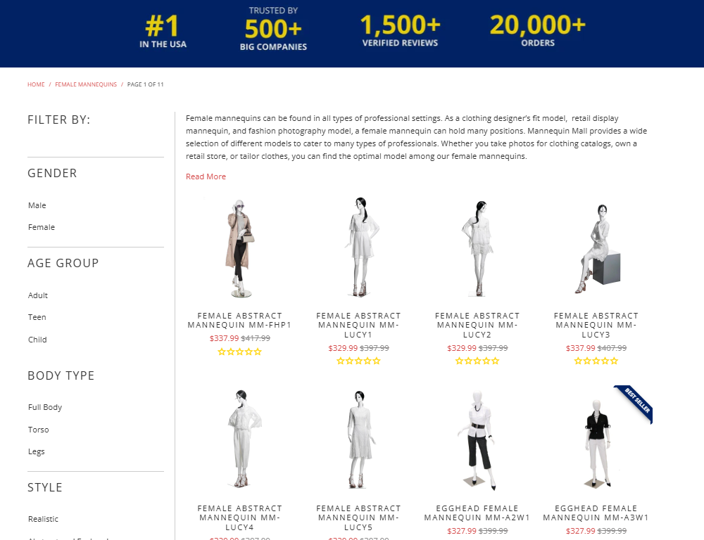
Mannequin Mall sells something most people don’t casually shop for: dress forms. That usually means long browsing sessions and tons of comparison. Instead of letting buyers wander through endless product grids, they rebuilt their sales funnel around intent clarity.
Their category pages start by helping visitors self-identify. The page immediately frames the use case – retail display, tailoring, fashion design, photography. Once the user clicks one, the entire customer experience reshapes around that single context.
They also reorganized funnel data around buying triggers instead of specs. Rather than leading with materials or measurements, their conversion funnel leads with real-world business outcomes like “perfect for window displays” or “best for travel shows.”
Pricing is paired with context, not discounts. So instead of “$349,” users see “$349 – most popular for retail storefronts.” Their checkout flow continues this logic. They show accessories only if they logically connect to the selected use case. That keeps the funnel moving forward without introducing new decisions that slow things down.
Takeaways you can apply for conversion rate optimization:
- Structure your product categories around why people buy, not what you sell.
- Replace technical specs at the top of the page with real-world usage scenarios.
- Attach pricing to context so users know immediately if a product fits their situation.
- Trigger upsells based on use case, not just average order value or product type.
[fs-toc-omit]2. Freeburg law

Freeburg Law operates in a space where hesitation isn’t about price – it is about fear and uncertainty. So they restructured their pages around emotional stabilization first.
Their criminal defense pages open with things the visitor is already thinking – urgency and concern about what happens next. They first explain the exact process the visitor is about to go through, step by step, before any form appears.
They also changed where and how contact forms appear. Instead of one long form at the bottom, they use short and staged contact prompts throughout the page. Early on, it is a simple “Call For A Free Case Evaluation.”
Later, after explaining the process, they introduce a more detailed intake form for users who are ready to commit. This sequencing respects the mental readiness of the visitor rather than forcing a decision too early.
Their proof strategy is also tightly controlled. They place specific outcomes next to specific fears – for example, showing dismissal rates next to felony charges or reduced sentencing stats next to DUI cases. This aligns proof with the exact moment the visitor starts evaluating risk.
Takeaways you can apply for conversion rate optimization:
- Lead with emotional stabilization before asking for any desired action.
- Break contact forms into different stages based on readiness, not convenience.
- Align proof with the exact fear or risk the user is processing at that point.
- Explain the customer journey before asking them to start it.
[fs-toc-omit]3. DialMyCalls
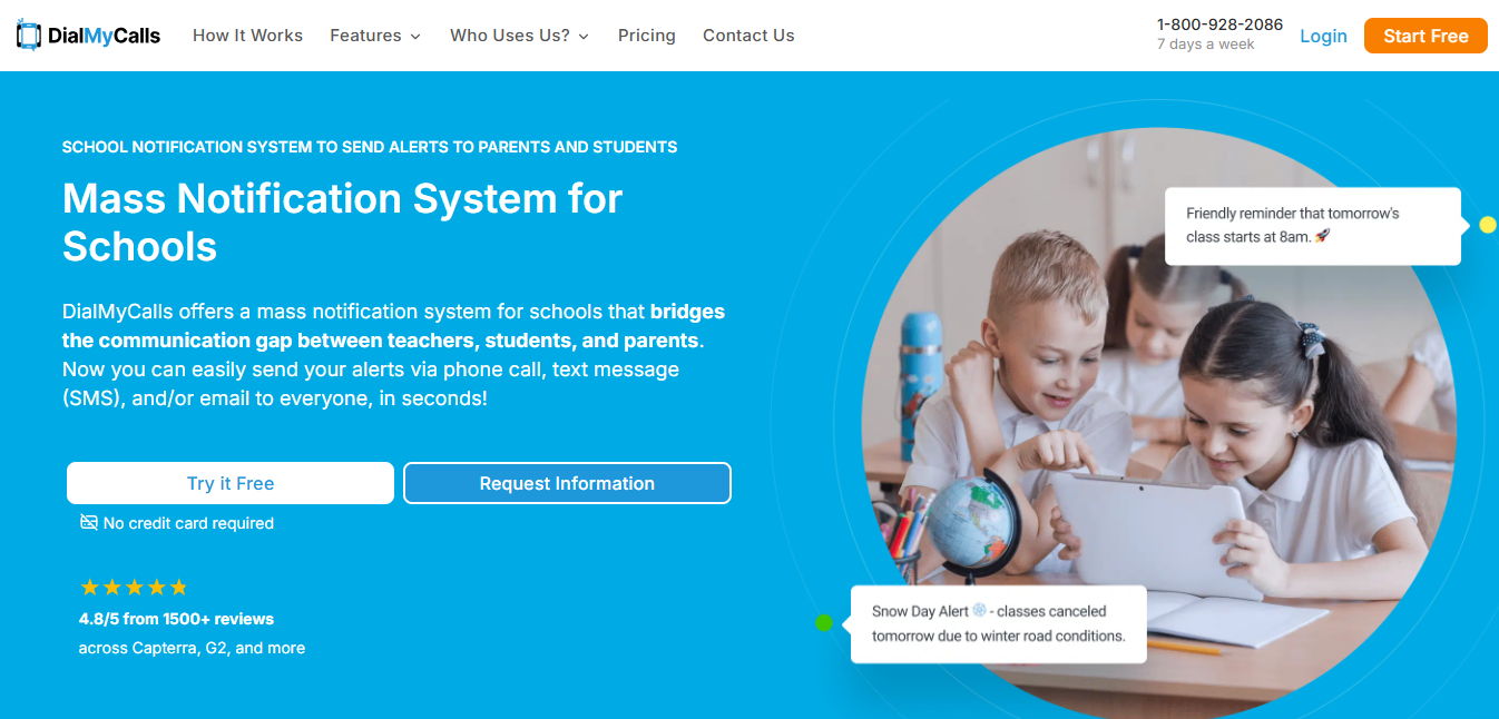
DialMyCalls notification system for schools redesigned its funnel around time compression. Their pages show how fast a task gets done. The first thing visitors see isn’t a product description, but a time-based outcome: “Send a message to thousands of people in seconds.” That immediately bases the decision on efficiency instead of features.
Their demo experience is also inverted. Rather than asking users to schedule a demo, they give instant access to a working version of the tool with preloaded templates. Users can send a test message in under two minutes without creating a full account. This eliminates the typical “wait to see value” phase and replaces it with “value before commitment.”
Takeaways you can apply for conversion rate optimization:
- Lead with time saved, not features delivered.
- Let users experience real value before asking for full signup or payment.
- Price your offer in units your buyers already use internally.
- Design your funnel around speed to outcome, not explanation depth.
Conclusion
Every stage of the funnel deserves the same scrutiny. Small misalignments add up, but small fixes win back lost buyers. So go through your funnel like you mean it and strip away the clutter. Match every step exactly with what people want and make it impossible to ignore. Do that, and your conversion funnel stops leaking buyers.
At Easytools, we know that messy checkouts and disjointed sales flows are what lose the ready-to-buy audience you worked hard to get. That is why we designed our platform so that your marketing team can launch products, set up high-converting checkouts, and manage everything easily.
With features like one-click purchases that skip multiple pages, automated checkout recovery that brings buyers back, built‑in pricing flexibility, and even customer portals that keep your buyers engaged after purchase, we keep more revenue moving through your funnel.
Try for free or schedule a demo to see Easytools in action.
No fees, no legal hassle – start selling anywhere instantly.
Sign up FREECancel anytime · No merchant lock-in

More
Related articles
Ready for more? Check out these related articles that will keep your momentum going. They’re packed with easy-to-follow tips and tricks to help you supercharge your digital goods business.


Start now
Take it easy with Easytools
Focus on creating, and let Easytools handle the behind the scenes work.
No coding · No credit card required · Built on Stripe
© 2024 Easytools. All rights reserved.